


This research was conducted in order to analyse the use of fuel in relation to CO2 emissions by country. In addition, the relationship between the dataset’s members has been investigated under research questions, and a broad comparison between countries will have made.
The article that you are reading, was published with the R codes. You can access these paper, slights and scripts on Github. Github link added to the attachments located at the bottom of the page[*].
Introduction
This dataset includes per Country CO2 Emissions from fuels annually since 1751 till 2014[1]. And these uses are expressed in million metric tons of the element Carbon. The analyses of the countries will be done in this notebook. Correlation graphs will be used to investigate it, and outputs will be offered for other applications. The research questions aimed to be answered in this study are:
- Are there similarities in the rate of fuel use in geographically close countries?
- What are the factors that have increased the use of emissions in countries in recent years?
- How did the increase in fuel use increase per capita carbon dioxide emissions?
General Information
This chunk of data contains data from 256 countries. Some major countries and kingdoms have about 300 years of data, the rest have 100–150 years of data. Data are sourced from the US Government’s Earth System Research Laboratory, Global Monitoring Division. According to the source, data is reported as a mole fraction of dry air, defined as the number of carbon dioxide molecules divided by the number of all molecules in the air, including the CO2 itself, after water vapor has been removed. The mole fraction is expressed as parts per million (ppm).
Data Analysis
Correlations
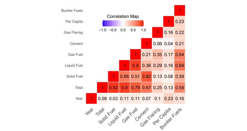
Evaluation
As you can expect, factors such as Solid Fuel, Liquid Fuel, Gas Fuel, Cement, Bunker Fuels have all had an impact on total carbon emissions. Firstly, I want you to point out to the Gas Flaring section. According to the Turkish National Committee of the World Energy Council, the reason for the weakness of the effect of 3 gas combustion on total carbon emissions is the carbon capture and storage systems used in the chimneys of the factories[2]. From here, we see the reason for the weakness we see in the correlation graph. Secondly, please draw attention to Solid Fuel and Cement. Although it is thought that it is not a complete relationship with a rough look, It has been stated by experts that the use of solid fuels as an alternative fuel for cement production has increased in recent years[3].
As it is seen, because there was no association forming in the opposite direction, there is no negative correlation. Now, let’s look at the total fuel uses. Also, I want to specify that Carbon Dioxide Per Capita will be evaluated alone.
Comparison of Countries
In this section, We will make a comparison of Countries to understand their carbon dioxide emission uses annually. And then, We will get into the details of the countries with similar results that We will encounter.
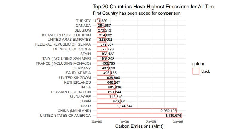
As you see the consequences of total fuel uses on the bar graph, SPAIN and ITALY has quite similar results as FRANCE and GERMANY have same consequences. Also, I want you to point out to the CHINA and USA. These two countries have a pretty too much uses. After comparing the USA and CHINA, We will compare the Fossil Fuel Usage of Turkey and Greece, as they are very close geographically.
Let’s compare USA and China first.
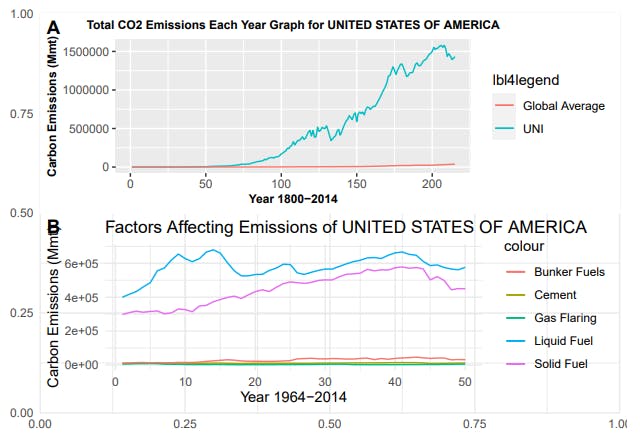
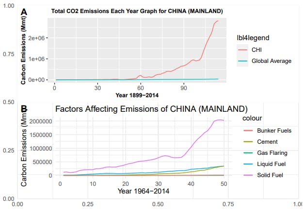
We have seen that the usages of these two Countries are significantly different from other Countries. While USA continues to use it on Solid and Liquid fuels at a noticeable rate, it is seen that the use of this fuel in the CHINA is limited to Solid Fuel. While USA uses have fluctuated decreasing in recent years, the rise in China’s emissions seems to have decreased in recent years. There is currently a decrease in the rate of increase.
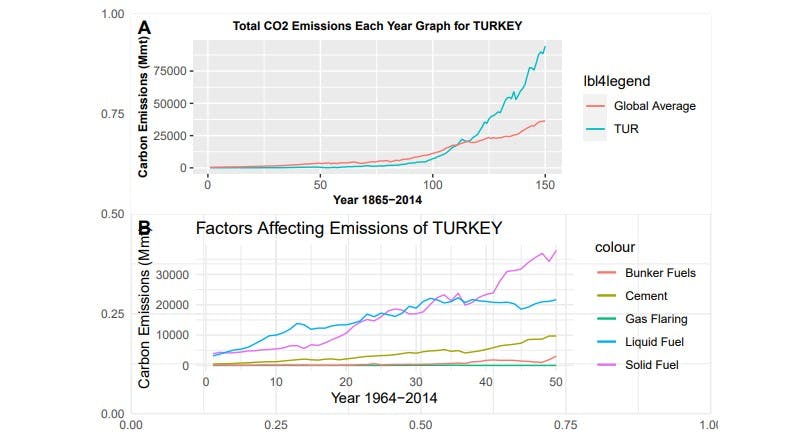
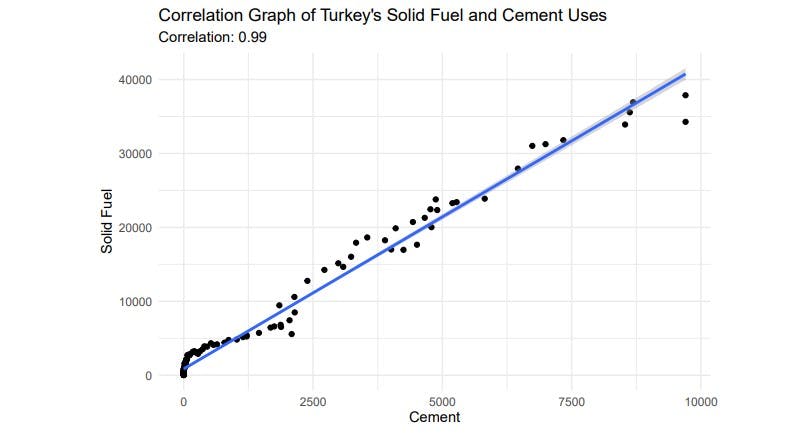
The data distribution of Turkey, has an increased tendency in the years specified. Despite the fact that, annual emissions are below the global average. On the other hand, the annual global average has also entered an upward trend. If we look at the second graph, we will see that the use of Solid Fuel and Liquid Fuel have especially increased in the recent years. Also, the use of the increase in cement use or production has also had an impact on this trend too.
Now, I want you to draw attention to annual carbon dioxide emissions of GREECE. Because I mentioned earlier that these countries will be compared due to their geographical proximity.
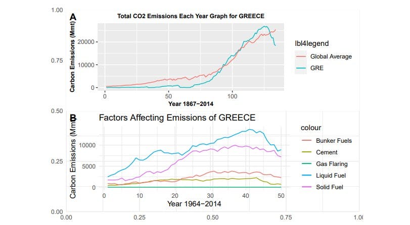
Despite the fact that Greece’s annual emissions are lower than Turkey’s, Turkey’s emission trend is slightly different from Greece’s in the recent years. We can observe that the emission trend has changed direction in the last 10 years. Let’s check out the second graph for the reason of that with visualization. In these years, the use of Liquid Fuel,Solid Fuel, Cement, Bunker Fuels have been reduced.
Now, We are going to look at fuel use per capita. Turkey has been used to make this comparison.
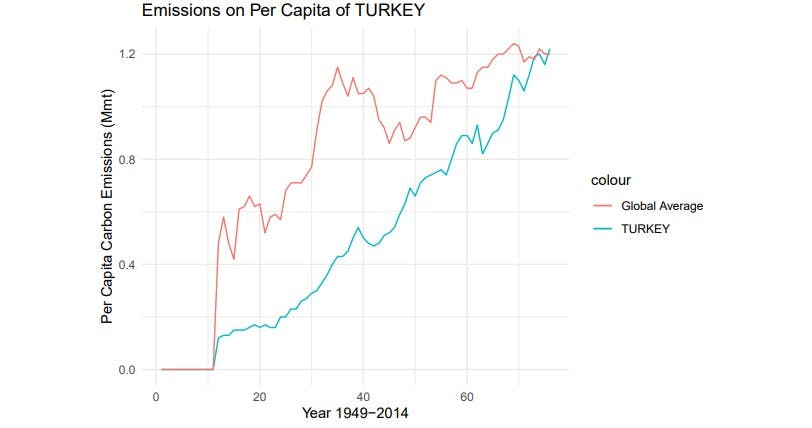
We have seen that emissions per capita are below the global average. But this increased trend is higher than the global average in the recent years.
Consequently, We deduce that although the main fuels used are similar in geographically close countries, the usage trend may be different. Also, while the world average of emissions per capita has passed a stagnant trend, it has been observed that Turkey is in an increasing trend.
Citations and References
[*]Github Link
[1] Boden, T.A., G. Marland, and R.J. Andres. 2013. Global, Regional, and National Fossil-Fuel CO2 Emissions. Carbon Dioxide Information Analysis Center, Oak Ridge National Laboratory, U.S. Department of Energy, Oak Ridge, Tenn., U.S.A. doi 10.3334/CDIAC/00001_V2013
[2] World Energy Council Turkish National Committee (February 2018)
[3]Prof. Dr. H. Yılmaz ARUNTAS, Turkiye Cimento Sektorunde Alternatif Yakit Kullanimi