For example, if the random variable X is an experiment where a coin is tossed into the air and the coin lands, there are two possible outcomes: 0 if the tails come in, and the 1st state space (0.1) if the tails come, the probability of the event is 0.5. happens. Hence the probability mass function:

It is expressed as. So far, we have explained the basis of probability theory through an example. Now, let's graph and visualize the event that I told through a new example with software. We Will See The Theory!
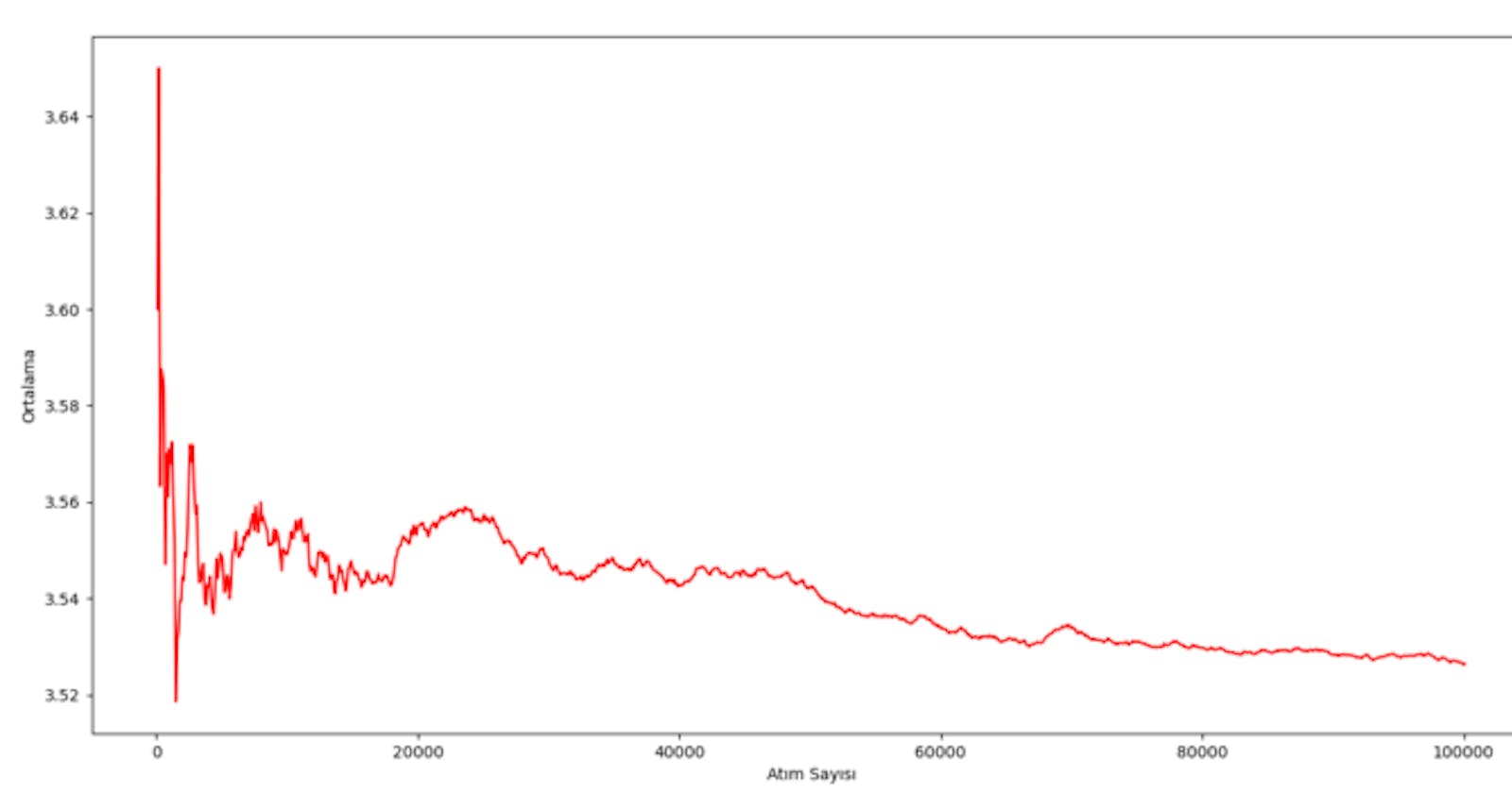
In our example this time there will be a dice. We will look at the average of the numbers on this dice and to what number this average converges to. Now, let's take a dice and roll the dice 100,000 times, let's write the numbers on a piece of paper… Joke, we can start by adding libraries.
We have created x and y lists together with our variables. We also determined the axis names of the plt chart. We created the X and Y lists to keep track of the number of dice rolled and the number of dice beats.
I would like to start the story with our 'number' variable While loop; We picked 100 times numbers from [1,6], and added it to the sum variable. Then our variable number of pulses was 0, we increased this variable by 100 so that we can show it in our graph. Then we divide the sum by the number of shots to our average variable and assign its mean. Finally, add the mean and number of pulses to the x and y lists.
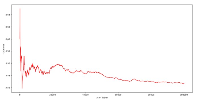
We have repeated this about 1000 times. Then we printed it using the codes ply.plot and plot.show. We printed our lists to the console with the print commands in the upper lines. You can examine; really attracts attention.
Now we are where I am most excited; I think it's getting closer to the center of gravity! Another detail is that this point is the arithmetic mean of the numbers on the dice:

As a result, we saw that it converged to our experimental possibility. In terms of practicality, you can apply our first example of coin dumping yourself.
